10 Common Web Design Mistakes Natural Food Brands Make
You have a great product but is your website successfully representing your brand?
Your customers are on a mission when they land on your website: they want the answers to their questions without straining to navigate your site. The typical customer is goal-oriented and searching for something, so it’s important that you don’t distract them with content that doesn’t help them. Rather, keep their attention by surfacing the answers they’re looking for in a way that’s pleasant for your customer.
That’s a lot of pressure, but the good news is you can learn from the mistakes of others. Here are 10 common mistakes to avoid when designing your website.
1. Talking about yourself instead of your customer
Your business needs to sell in order to make money, but if all you’re doing is selling and talking at people, or talking too much about yourself, you’re not adding value and your potential customers will walk away. The trick is to position the customer as the hero and your brand as the guide to help them get what they want.
2. Not capturing customer emails when they visit
You want to get useful customer data or you miss a huge opportunity to reach your audience and generate more revenue. One of the most effective ways to do this is to build your email list, and offer something of value to your customers so they’ll feel comfortable giving you their contact information. Creating a loyalty program, an informative ebook, coupons, or a newsletter that announces new products and special discounts, are all possible value propositions when asking customers to subscribe.
3. Shaming customers into subscribing
When you do ask for their emails, be sure to do it politely and in the right context. Don’t make people feel bad if they want to say no, don’t force people to sign up, and don’t make it difficult for them to opt-out. Manipulative tactics like the one below are not only shameful, they’re not effective in the long run.

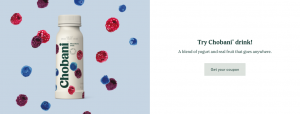
One beautiful example of a call to action to subscribe comes from socially conscious yogurt brand Chobani. The company offers a discount with a “Get your coupon” button, then directs you to a page to submit your email.


4. Not including links to social media
Once you have your relevant social media pages set up, make sure you display links or calls to action clearly on your website and emails so that you generate multiple paths for customers to engage with your brand and get to know what you offer.
5. Only using one type of content
Don’t overload on one type of content or your customers will get bored and may not stay long enough to convert. People also prefer to consume different types of content at different times and on different devices so variety is key.
Create a balance of text, images, video, audio, and infographics where appropriate. Remember to use high-quality photos to show your product. Recipes using your products as ingredients are really effective and can engage your customers in different ways.
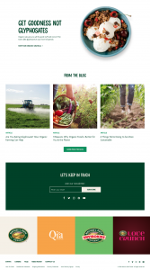
Nature’s Path Organic is another example of a great website that speaks to their customer’s needs, has clear calls to action to capture email and links to social media, and has a good balance of colors, images, textual content, and motion graphics at the top.


6. Content overload
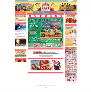
Plan your content carefully, and use customer feedback and data to understand how much information is just enough. Are people coming to your site and leaving right away without looking at other pages? Are there pages that almost no one ever visits? Are there too many colors and not enough white space on your homepage like the one below?

Your goal is to provide just enough information and at the right time and place. Let it be easy for your customers to find what they need. And remember: white is a color, too.
7. Poor navigation
According to a usability study, drop-down menus are small annoyances that create friction for the user. Menus can get particularly unwieldy when there are too many items to choose from. Make your navigation easy to find, to the point and clear, and try not to have more than a few items for your customers to choose from. As mentioned in mistake #1, make sure you’re thinking of this navigation from the user’s perspective to help them find what they are looking for as fast as possible.
8. Font is difficult to read
Don’t let poor font size and style be the reason you’re not growing your customer base. You may have good products and services, but they need to be findable at a glance. Think of the diversity of your audience as well, and make sure the font you use is easy on the eyes.
9. No pricing
Especially for specialty products where the price can vary, even if your answer to the question, “How much do you charge?” is “It depends,” customers often come to websites to find out pricing information and get annoyed when it isn’t there. If you can’t give exact pricing, consider giving enough information about what goes into deciding what you charge, so that potential customers trust where you’re coming from before they commit.
10. No contact info
Don’t hide your contact information! All relevant information should be clearly displayed on your website, including where to buy your products locally if possible. If you have limited ability to provide support through one channel, set expectations immediately. For example, if it takes you 48 hours to get to email inquiries, mention it at the top of your contact form.
You can also use this as an opportunity to direct people to your social media channels to connect with someone on your team or other members of the community to help answer questions.
What are some problems you’ve had with your web design or seen on others? Are there other mistakes you see a lot that we missed? Let us know in the comments!


